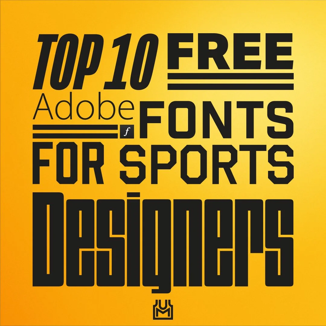
TOP 10 FREE ADOBE FONTS FOR SPORTS DESIGNERS
The fonts depicted are free for Adobe subscribers. Odds are if you’re a Sports Designer you have an Adobe subscription.
If you’re into sports design, you’ve probably spent countless hours searching for the perfect font for a given design. You’ve probably also got a handful of go-to fonts that are your favorites for score graphics, uniform numbers, or any other application you can think of. Having spent quite some time myself on Adobe Fonts, I decided to make a list of my Top 10 Free Adobe Fonts for Sports Designers, with the caveat that these are free* to use for Adobe subscribers.
*See fonts.adobe.com for usage rules and restrictions
Click on each font’s sample image for a link to the font on Adobe Fonts.
No. 1 - Mongoose
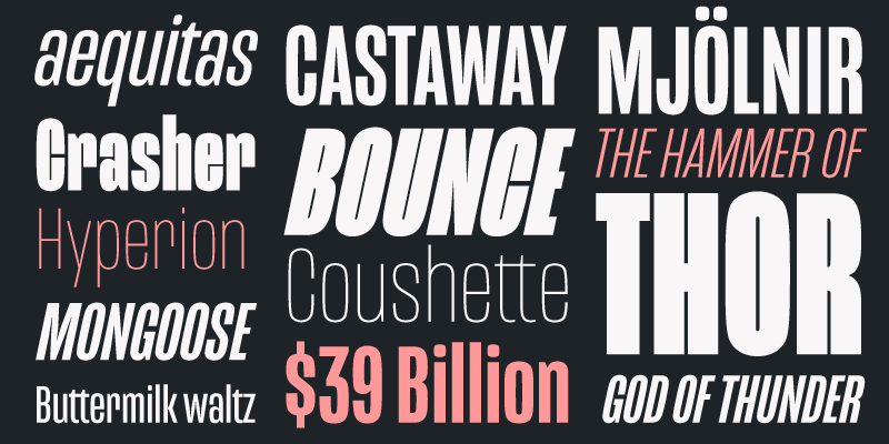
Image from Adobe Fonts
A highly versatile font with lots of weight and italic options, Mongoose has been adopted as the “official” font of UniMockups and has been incorporated into the website. Mongoose is similar, if not the exact font, to fonts used by numerous professional sports organizations over the years, including the NBA.
No. 2 - AKTIV GROTESK
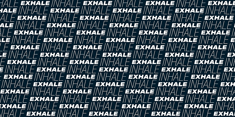
Image from Adobe Fonts
Another popular font with professional sports organizations, Aktiv Grotesk again has many weight and italic options available. The bold options of this font are a great choice for graphics that need eye-catching titles, scores, stats or anything else that needs to pop while the lighter options are great for subtext.
No. 3 - MYRIAD

Image from Adobe Fonts
Used by Adobe themselves, Myriad is a very elegant font with lots of options to make your text stand out. I’ve seen this font used by lots of designers for various presentations. It’s a solid choice for clear readability.
No. 4 - INDUSTRY INC
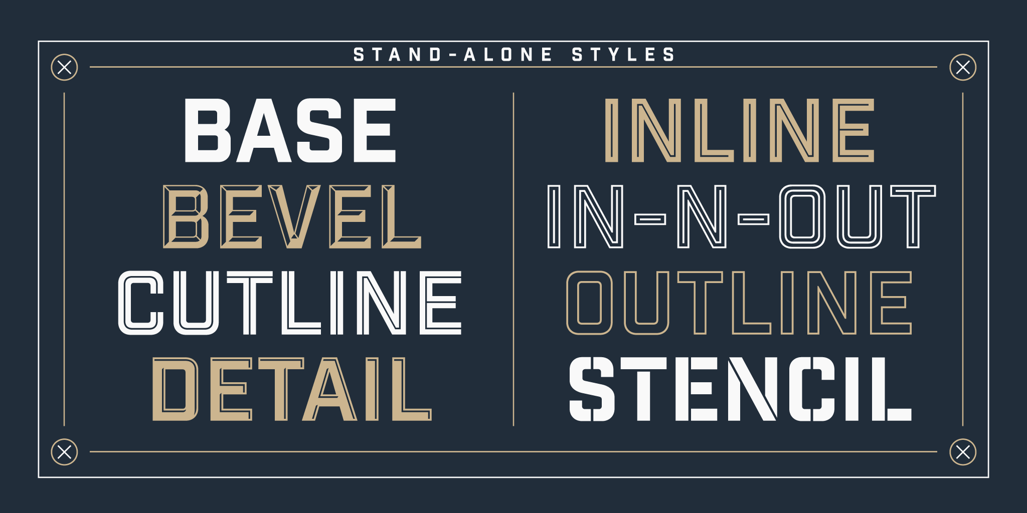
Image from Adobe Fonts
Industry Inc offers a wide-range of options that can be useful in various sports applications. The base font is very clean and bold, but there are also beveled, outline, inline, stencil and other options for maximum versatility.
No. 5 - PROHIBITION
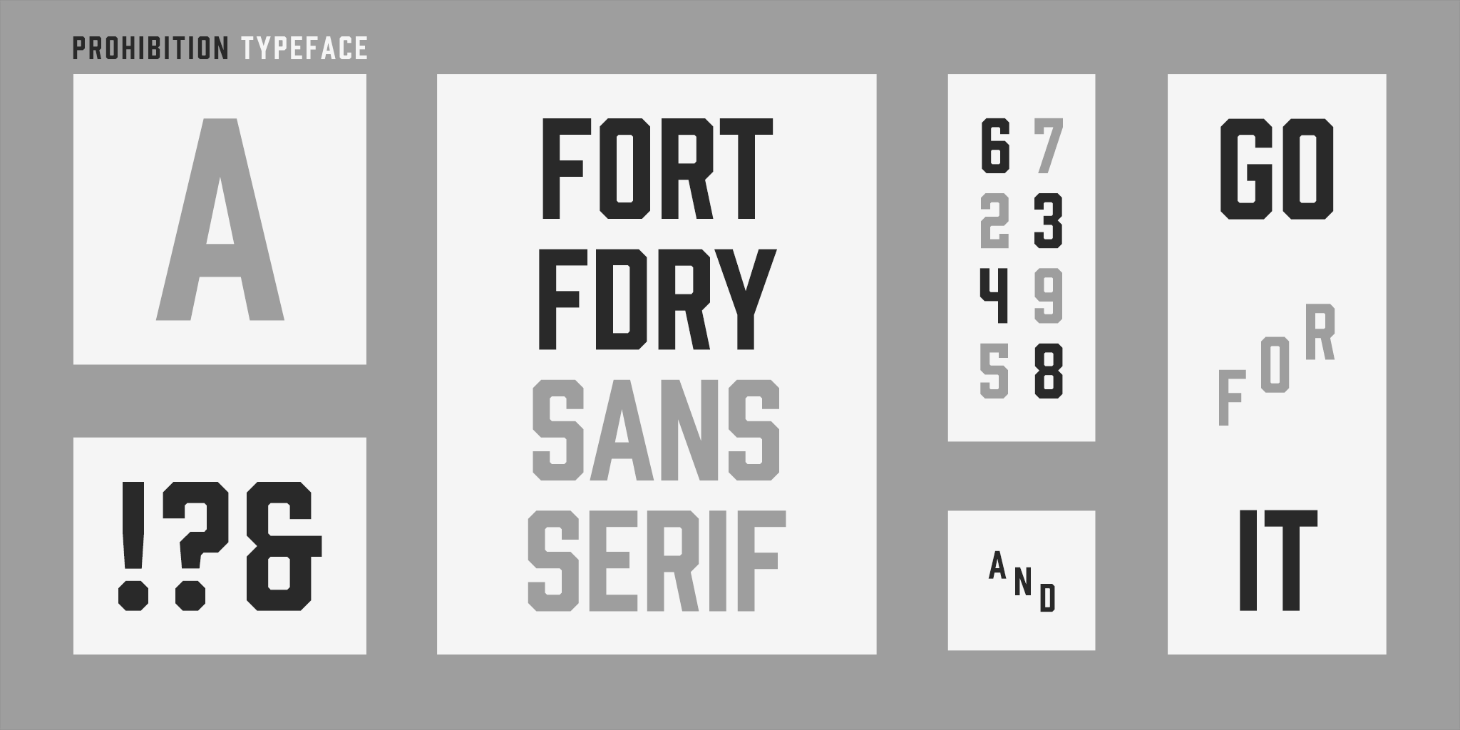
Image from Adobe Fonts
I love Prohibition, especially the number set. For me Prohibition is stronger than fonts like Varsity Block. It just looks more polished and professional. The sports applications are limitless with this font.
No. 6 - BROTHERS

Image from Adobe Fonts
Brothers is a great font for vintage looks, as seen in the sample image above with the New York Knickerbockers text. It’s a super-unique font that can be used in a variety of ways to add character to any design. Brothers also has an interesting number set that looks great in the right context but I’ve found them too be too wide for my uniform designs.
No. 7 - CARBON

Image from Adobe Fonts
Carbon comes with lots of weights and italics options, but the best part of the number set. I’ve used this font many times within UniMockups templates for text on jock tags. I’ve seen the number set used by multiple pro sports organizations for stat graphics.
No. 8 - FUTURA PT
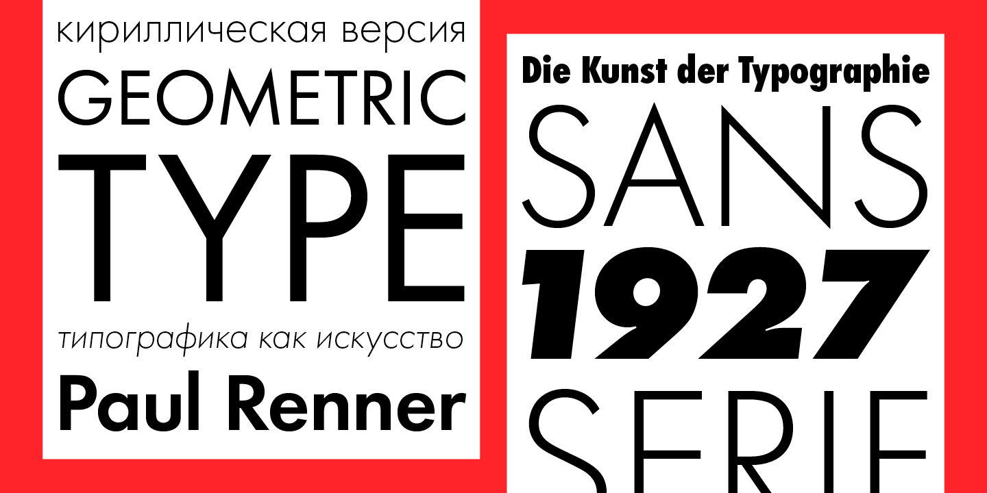
Image from Adobe Fonts
Yes, it’s overused - but there’s a reason. Futura just looks good most of the time. It’s extremely versatile, and the Pittsburgh Steelers use it for their uniform numbers.
No. 9 - DIMENSIONS
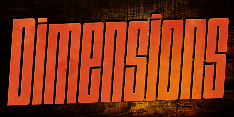
Image from Adobe Fonts
Dimensions is a super-condensed font with various weights available. I absolutely love this font for adding blocky chunks of text with a very distinct look. Dimensions is great for adding texture and 3D finishes, as well.
No. 10 - OCTIN

Image from Adobe Fonts
There’s actually a version of this called Octin Sports, but I don’t like it as much. This is another font similar to Varsity Block and Prohibition that is great for sports applications. The designers even used a stadium in one of the sample images, as seen above.